Setting Up a Well Template
To show a curve in an empty track, right-click the track and choose Advanced Track Settings.... In Track Settings, set Track Width to 100 for this example. Expand Curves and the relevant LAS type group, then turn on the caliper curve. For bulk selection by type and a current settings image, see Well correlation view.
To adjust the curve display, right-click its name in the track header to open Curve Settings.
In this example, the following adjustments were made:
- Renamed the Curve Nickname
- Updated the Units
- Selected a filled Curve Type (highlighted in green)
- Selected a Step Style (highlighted in blue)
- For a Lines or Filled Lines curve, selected a Line Style (Solid, Dot, Dash, Dash dot, or Dash dot dot)
- Set the Min Value and Max Value
- Chose curve Color and Width
- Chose Fill color
For a current view of the Curve Settings panel, including Line Style and palette controls, see Working with Palettes.
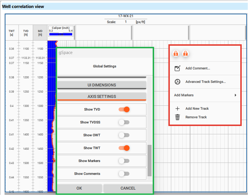
To add three additional tracks for the curves, right-click on the visualized track field and select Add New Track (highlighted in red). Next, access the global settings (highlighted in green) by right-clicking on the well name at the top.
Scroll down to the Axis Settings and enable the visualization of TVD (True Vertical Depth) and TWT (Two-Way Time).
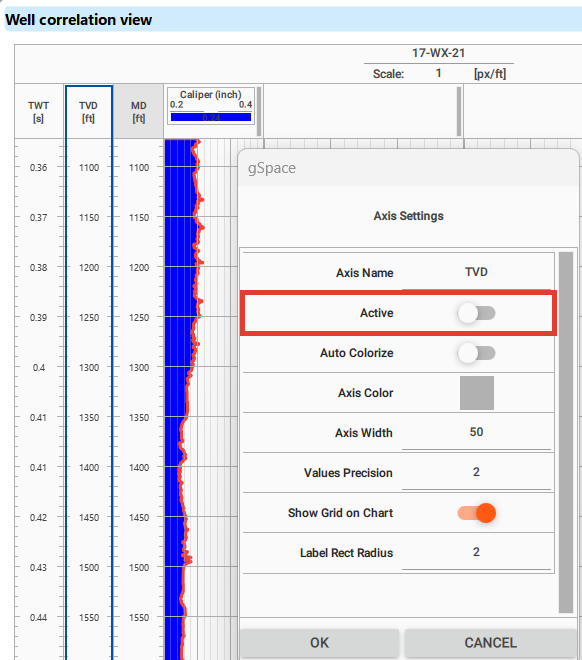
To set a priority scale, right-click on the scale field you want to designate as the main one. This will open the settings. Enable the Active function, and the selected scale will become the primary one, highlighted in gray in the label field at the top.
In the picture below, the active scale is set to MD. For the active scale, the Active function does not appear in the settings, as it’s already designated as the primary scale.
Lets add curves to the tracks as described above.
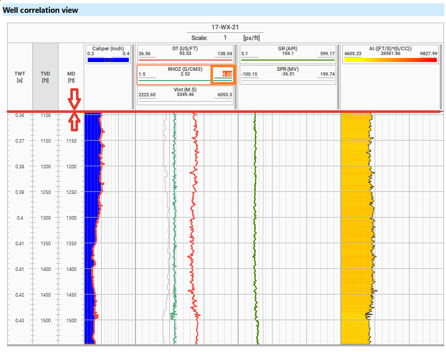
To adjust the size at the top of the panel, click and hold the left mouse button on the border (highlighted in red) of any axis field, then drag to resize the field.
You can change the minimum and maximum values by left-clicking on the curve name field (highlighted in orange) while it highlighted.
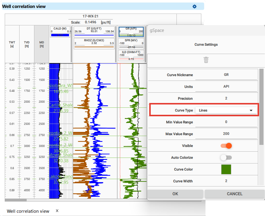
For continuous curves such as GR or Density, a convenient standard visualization type is linear.
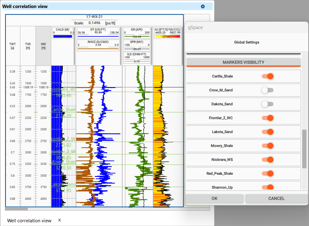
To visualize markers, open Global Settings, scroll down to Markers Visibility, and enable the markers you want to display.
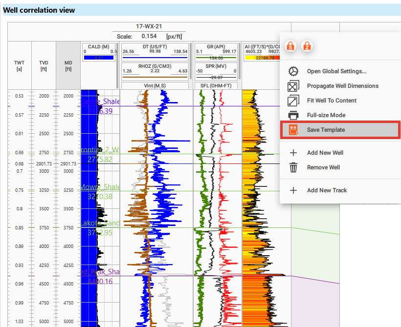
Once you have set up a Well template for correlation that suits you, save it and it will always be available in your project. To save the current setup, right-click the well name at the top of the well section and choose Save Template.
To apply a saved template directly in the view, right-click the well name and choose Apply Template, then pick the template by name from the list that appears. This is available in every well log view, including the Well log view of the Wells data workspace. A Well correlation view lists the templates saved for well sections and applies the chosen one to the current well section, while a single-well Well log view lists the templates saved for single-well views. If no template has been saved yet, g-Space reports that there are no saved templates to apply and asks you to use Save Template first.
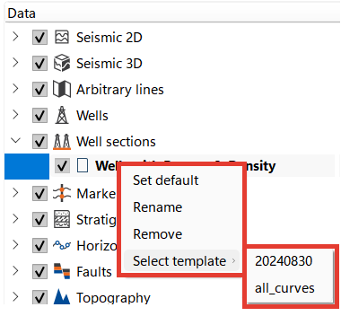
A saved well template can also be applied from the Data Manager: right-click on the desired section within the Well Sections and choose Select template.
You can also manage saved templates from the Wells bar. In the Templates section, use Select template to apply a saved template to the active Well log or Well correlation view. Use Manage well templates to select a saved template and then rename or delete it. A new name must not be empty or duplicate another template name; deletion requires confirmation.