Cross plot
Cross-plot analysis is allowing users to compare two variables on a scatter plot to identify relationships, trends, or anomalies.
To create cross plot view go to the Views bar, navigate to Graphs and click on Cross-plot button:

To set what data to be analyzed set parameters in the Statistical analysis bar:
Cross-plot analysis is helpful to the user to understand the relation between two or more seismic attributes. In the Statistical analysis bar the user can able to select the seismic attributes and generate the cross plot in Views
In the Data Source dropdown menu, you can choose the type of data to analyze. Available options are XY Data, Well Logs, Tops and Zones. Tops and Zones are the two well interpretation options; the option previously named Markers is now Tops.

When XY Data is selected as the data source in the Statistical analysis bar, the interface allows users to analyze relationships between two variables (X and Y coordinates). This mode is particularly useful for investigating well attributes, seismic attributes, or any spatially correlated data that can be expressed in an XY format.
For the Horizontal Group (X-axis) and Vertical Group (Y-axis), you can select a group of well attributes (such as X, Y, KB), topography, grid maps, or horizons as the group for analysis. You can then specify the desired parameter from each group.
The Color section has a Mode dropdown. Choose Density to color points by their concentration in X/Y space. The density color scale adjusts to the plotted concentrations. Choose Parameter to color by a selected value. Use Palette to select the color scale for density or continuous parameter values. In Density mode, the Color Group and Parameter rows are hidden.
The Bounding Polygon option allows you to limit the analysis to specific areas of interest. By defining a polygon, you can filter out data points outside the selected region. If no polygon is required, leave this option set to Not required.
With Data source set to Well logs and Color Mode set to Parameter, the example below shows Parameter set to Wells.

When Well Logs is selected as the data source in the Statistical analysis bar, the interface enables the analysis of relationships between well log measurements for individual wells. This is especially useful for examining the correlation between different well log parameters (e.g., porosity, resistivity, sonic log) within a specific well.
For the Horizontal Group (X-axis) and Vertical Group (Y-axis), you can select a specific well from the Group dropdown menu and then specify the parameter from the selected well (such as RHOZ, DEPTH, DT, etc.).
The Group dropdown is not limited to a single well. In addition to any individual well, you can choose All wells to analyze the log data of every well at once, or a named well section to analyze a saved group of wells (well sections act as folders/filters of wells). The parameter list then contains the log curves shared by the wells in scope. These options are available for the Horizontal and Vertical groups.
In Parameter mode, use the Color Parameter to color points by a selected log, such as DT. Choose Density instead to color by point concentration.
With Well logs and Mode set to Parameter, the Color section shows Palette and Parameter; there is no Color Group dropdown, and the coloring always covers every well that has log data. The list starts with Wells and No color, followed by the log curves available for the wells in scope. Choose No color to leave the points in a single default color.
Besides a log curve, the Color parameter can be set to Wells. In this mode the points of each well are drawn in their own distinct color and each well is added to the legend as a separate entry labeled with the well name, so you can tell the wells apart on the chart. Wells appears when at least one well with log data is loaded and is initially selected when you choose Parameter mode for Well logs.
The Polygon row of the Filter group, which holds the bounding polygon described above, is available for the Well logs data source as well. In this mode the polygon selects whole wells by their wellhead position, as it does in the Histogram and Variogram graphs: a well whose head lies outside the polygon is left out completely, instead of its log samples being clipped along the wellbore. Leave the row set to Not required, the default, to analyze the whole project area.
Filter by MD
- Manual: Allows you to manually input the MD values.
- By markers: Uses predefined geological markers to select the interval of the analysis.
Filter by value
For the Well Logs data source you can also restrict the analysis to a value range on each selected parameter. A Value filter dropdown is provided for the Horizontal and Vertical parameters, below the corresponding Parameter dropdown, with its From and To fields in the next ribbon column:
- Horizontal value filter — From / To
- Vertical value filter — From / To
Set a filter to Manual and enter the From and To bounds of the range to keep; samples whose value falls outside the range are dropped. Leave a filter set to Not required, the default, when no value range is needed. The value filters can be edited only when Data source is set to Well logs; in XY Data, Tops and Zones mode the rows stay visible but are greyed out. Value filters are applied together with the MD, marker, polygon and well filters, and the cross-plot is refreshed using the filtered log samples only. The Polygon and Wells filters decide which wells take part, while the MD and value filters narrow the samples taken from each of those wells.
Filter by wells
The Wells dropdown of the Filter group restricts the plot to a chosen set of wells. It is available for all four data sources — Well logs, XY Data, Tops and Zones — and offers:
- All wells — the default; every well of the project is plotted.
- Well section, Well folder and Well filter — the wells of a named well section, of a well folder of the Data Manager, or of a saved well filter. Choose the name in the Set dropdown, which lists the sets of the selected kind in alphabetical order.
- Individual wells — the wells you name in the Wells field to the right of Set. Separate the names with commas or semicolons; a UWI is accepted in place of a well name.
The selected set is resolved again each time the plot is rebuilt, so later changes to the section, folder or filter are taken into account. If the selected set can no longer be found, no wells are plotted. A saved cross-plot view keeps the selected mode, the set name and the well names.
Tops and Zones
The Tops and Zones data sources plot well interpretation instead of log samples. They correspond to the Tops and Zones subsections of a marker set in the Data Manager; see Markers for how tops are picked and zones are built from them.
With Tops, the axis dropdown is titled Top and lists the marker tops of the project and the Parameter dropdown offers MD, TVD and TVDSS, followed by the custom attributes of the selected top. Each plotted point is one well in which that top is picked.
With Zones, the axis dropdown is titled Zone and lists the zones of the Conceptual Model when that model defines any, and otherwise the zones of the current zone set. The Parameter dropdown offers TVD enter, TVD exit and TVD thickness, the same values as the Zones properties table. Each plotted point is one well in which the zone is present; a well whose base pick lies above its top pick is left out of a TVD thickness plot.
Both data sources are configured like the other modes: choose a top or a zone and a Parameter for the horizontal and vertical axes and, when Mode is Parameter, for Color. In these two modes that dropdown row is named after the selected data source — Top with Tops and Zone with Zones — in the Horizontal and Vertical columns, and in Color when Mode is Parameter. For XY Data, the row is called Group; with Well logs, the Horizontal and Vertical Group rows remain while the Color Group row is hidden. In Density mode, the Color selection rows are hidden. The Bounding polygon and Wells filters apply, while the Filter by MD and value filter rows are greyed out.
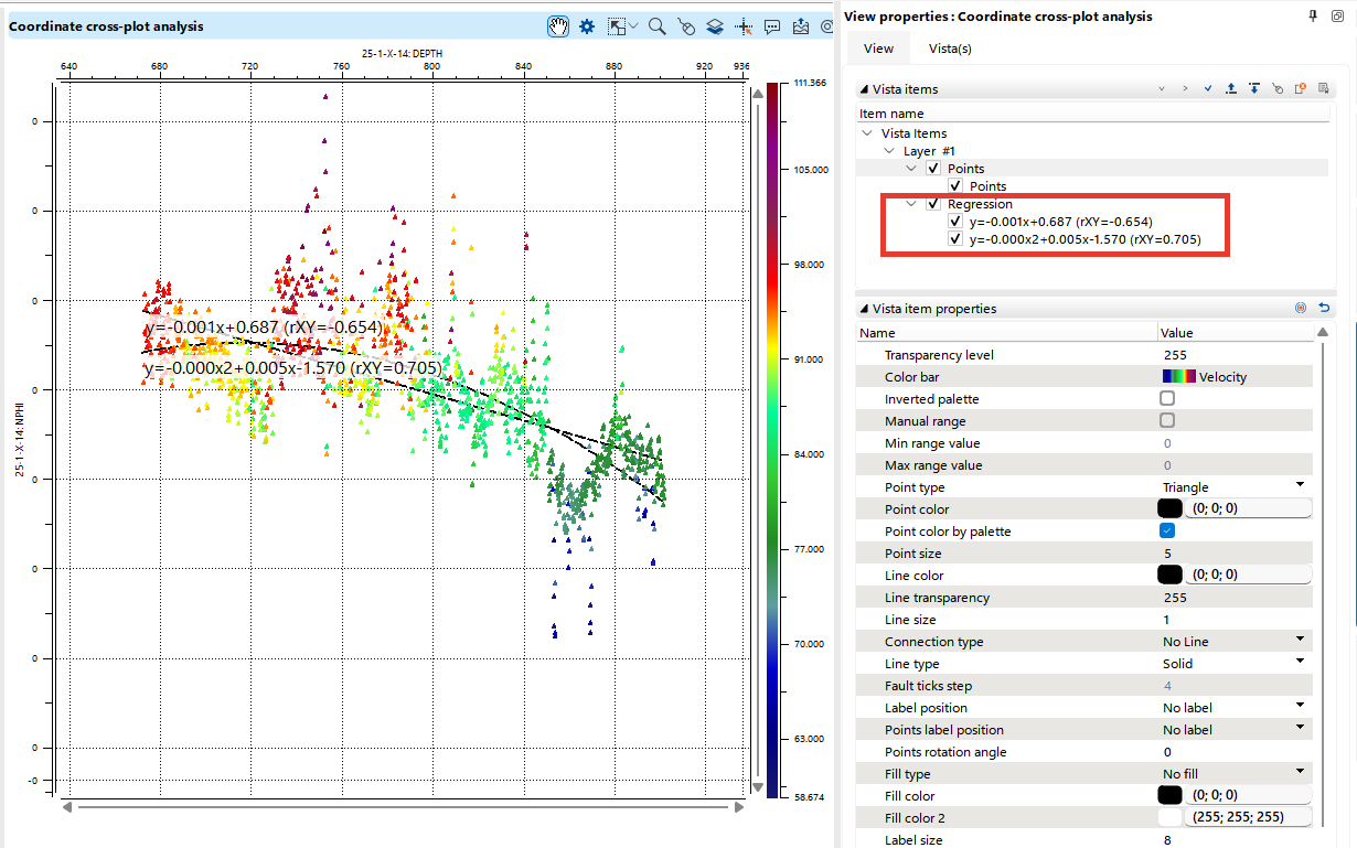
In the Cross-plot view, you will find two regression functions: linear and quadratic. These functions help in identifying trends and correlations between the selected parameters. Both regression lines are also accessible through the Object tab within the Visual Settings panel, where you can further customize the visual settings, such as line color, thickness, and other aesthetic preferences, to suit your needs.
The Density example below shows the colored plot, its density scale, and the Visual Settings panel.