Histogram
Histogram analysis allows users to visualize the distribution of a single variable, helping to identify frequency patterns, ranges, and data trends.
To create Histogram view go to the Views bar, navigate to Graphs and click on Histogram button:

Each click on Histogram opens a new Well log histogram view, so several histograms can be kept open at the same time. A new view starts with the parameters of the histogram view that is active at that moment.
To configure the analysis, set the parameters in the Statistical Analysis bar:
- Data Source: Available options include Well Logs and XY Data.
- Group and Parameter: When working with Well Logs, users can specify the desired well log group and the parameter to be analyzed. For XY Data, users can select a group containing numerical datasets (e.g., amplitude, porosity).
- Filter Options: Use Bounding Polygon, MD Range, or By Markers to refine the data included in the analysis:
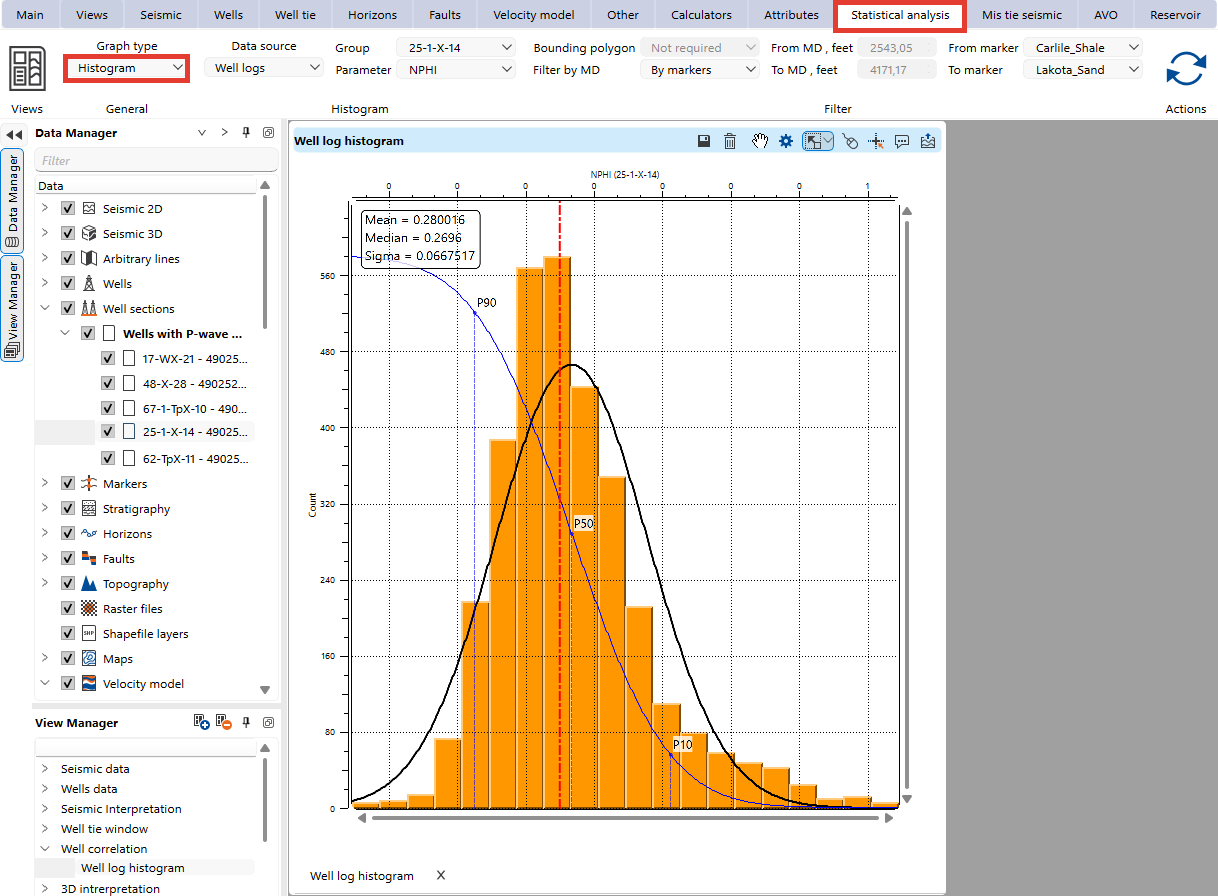
These parameters belong to the active Well log histogram view only. Changing a parameter updates that view alone, while the other opened histogram views keep their own parameters and the distribution they already display. When another histogram view is activated, the Statistical analysis bar shows the parameters saved for that view.
The Histogram view automatically displays the following statistical parameters for the analyzed data:
- Mean
- Median
- Standard Deviation
Visual Settings
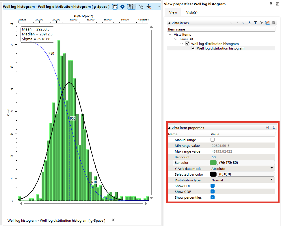
Users can customize the Histogram display for better interpretation. Open the Visual Settings panel from the histogram view tool bar, switch to the Object(s) tab and select the histogram item to list its settings under Object item properties:
- Bar Count: Adjust the number of bars to control the resolution of the histogram.
- Bar Color: Set the color of the bars for improved visual clarity.
- Selected bar color: Set the color used for the bars that are selected in the view.
- Y Axis data mode: Choose whether the bar heights are shown as Absolute counts or as Relative percentages of the analyzed values.
- Manual range: Select this option to enter your own Min range value and Max range value and cut the distribution to that interval. When it is cleared, both fields are read-only and report the actual range of the analyzed data.
Optional overlays can be added to the histogram:
- Distribution type: Choose the theoretical distribution that is fitted to the analyzed data: Normal, Lognormal, Exponential or Uniform. The curves below are drawn from this distribution, so the observed data can be compared with the expected model.
- Probability Density Function (PDF): Visualizes the likelihood of data values within the distribution.
- Cumulative Distribution Function (CDF) Curve: Represents the cumulative frequency of the dataset.
- Percentile Markers: Visualize key percentiles, such as P90, P50, and P10, for additional statistical insights.