Well correlation view
Well correlation - allows the user to create views where the user can visualize the different types of the well data such as log data (continuous and discrete), point data, comment logs etc. Well correlation view is designed to perform easy stratigraphic log correlation.
To create Well correlation view go to the Views bar in the Ribbon bar and click on Well Correlation option:

Below is an example display of a well correlation window.
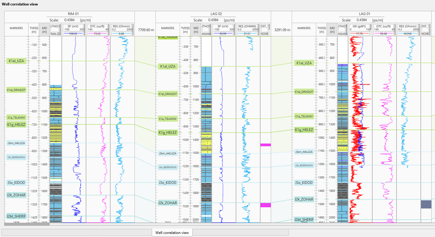
View tools
The header of the Well correlation view holds a row of buttons; hovering a button shows its name. Four of them are picking tools: Hand, Capture, Select interval and Edit markers. Only one of them is active at a time, and the active tool decides what a click or a drag inside a track does. Hand is the tool the view starts in.

Hand moves the display: hold the left mouse button inside the view and drag to scroll sideways across the wells and to move the well under the cursor up or down in depth.
Capture lifts one depth interval of a curve out of the view so that it can be held against another well. Select the curve in its track, or use a track that holds a single curve, and then drag vertically inside that track: the interval that was dragged over is copied into a floating image of the curve, together with the marker lines it crosses. Drag that image over another well to compare the two logs, resize it by its edges, press I to mirror it from left to right, and press Delete while the cursor is over it to remove it. Dragging in a track that has no selected curve only shows the message Please, select a curve.
Select interval opens the LAS editing wizard from the view: with this tool active, click a curve, or drag over a depth interval of it to preset that interval in the wizard. While another tool is active, the same click or drag leaves the wizard closed.
Edit markers makes the marker lines of the tracks editable, so that a marker can be dragged to another depth.
Beside the picking tools the header holds Edit curves, which opens the same LAS editing wizard directly, with no curve or interval picked in the view.
Adding Well sections:
To add a well section, navigate to the Data Manager. Right-click within the interface and select "Add Well Section" from the context menu. A new window will appear prompting you to provide a name for the well section. Enter the desired name and confirm your selection.
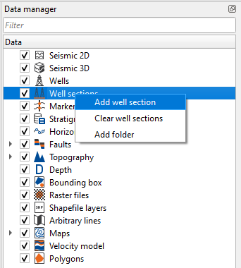
General settings:
The view has separate areas for well names, axes, curves and track displays.
Right-click a well header, axis, curve or track to open the settings and commands for that area.
Well Name Display: The header at the top of each well shows its name. Right-click it to open the well menu, including global settings.
A more detailed description of the global settings can be found below.
Axis Tracks and Settings: Axis columns display depth, time or other vertical scales.
By right-clicking on these tracks, users can access settings to adjust the scale or other visualization options specific to the axis.
To change the order of columns for a well, drag an axis header or the MARKERS header left or right over another axis or curve track.
The vertical axis can be zoomed in or out by placing the cursor within the axis track and adjusting the scale accordingly. In contrast, the horizontal axis can be scrolled from right to left and vice versa.
To set the priority scale, first, visualize the desired axis, then right-click to open its settings, and make it active.
The title of the active axis will turn gray, indicating it has been prioritized. By default, the priority axis is set to measured depth (MD), as shown in the figure where the MD field is highlighted in gray.
When the comments column is displayed (see Show Comments in the Global Settings described below), right-clicking that column opens the same Axis Settings window with four additional rows that apply to the comments. These rows are not shown on depth or time axes such as MD, TVD or TWT.
Font Size: Size of the comment text in the comments column, 10 by default. The pop-up that appears when the cursor is hovered over a comment to read its full text uses the same size.
Comment Color: Color of the comment text, black by default.
Show MD: By default OFF. If turned ON, the measured depth of each comment is added in parentheses after the comment text, for example Top Sand (1520), while a comment with no text shows the depth on its own. The depth follows the view units and the Values Precision set on the same axis.
Wrap Text: By default ON. Long comment text is wrapped over several lines so that it stays readable when the comments column is narrow, and the comment row grows in height to fit. Turn it off to keep each comment on a single line.
Curve Tracks and Settings: Curve tracks display logs such as GR (Gamma Ray), DT (Sonic) or AI (Acoustic Impedance).
Right-click a displayed curve to open its settings, including the curve nickname and units.
Track Displays and Settings: Right-click a track to open its menu for comments, settings, markers and track changes. To resize it directly, drag its right border horizontally.
Right-click the well name header to open its menu, shown below.
Additional tools are also available.
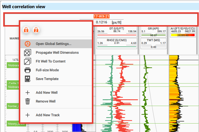
Open Global SettingsIt is where the user can add/remove any well markers/curves etc besides changing the overall look and feel of the display.
Propagate Well DimensionsOnce it is activated, it will propagate the same settings across all the wells.
Fit Well to ContentIt will fit all the wells to the same. It is kind of Zoomed out.
Fit to Synthetic CurveIt scales the depth axis of the well to the interval covered by its synthetic seismogram. A well that has no synthetic is fitted to its full content instead.
Full-size ModeIt will open a new window for print friendly image to print the well correlation.
Save TemplateThe user can save the whole setup as a template.
Apply TemplateApply a previously saved template to this well.
Add New WellThis will allow the user to add any additional wells.
Remove WellAs the name suggest, the user can remove any wells from the display.
Add New TrackIt will add an empty track
Well correlation views and well sections keep their current display settings when you switch away and return. Saving the project also saves each current state, so reopening restores it even if you did not save the settings as a template. If you reopen without saving the latest display changes, those changes are discarded; a well section with an assigned template returns to that template.
Out of these all options, the most important one is Open Global Settings. We are going to learn about it in the following section.
Select Open Global Settings and a new pop-up window opens.
Units TypeThe user choose either Metric or Imperial from the drop down menu.
Relative Well DistanceBy default OFF. If turned ON, it will display the relative well distance
Depth on HoverIt will display the MD when the cursor is hovered on the well log.
Curve Depth On HoverDisplays the curved depth of the well log.
Show Marker ValuesDisplays marker depth values of the well log.
Show Marker NamesIt will show the marker names of the well log.
Zones Transparency (%)Controls the transparency of zone fills in the Well correlation view; 70% by default.
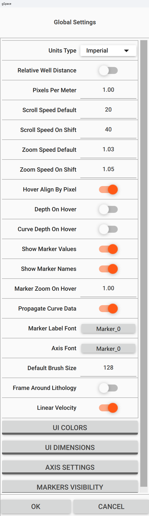
Linear Velocity
UI COLORSThis is nothing but User Interface (UI) to modify the color settings of the displays. When we click on it, it will expand.The user can change the foreground/back ground etc.To collapse it, just click on it one more time.
UI DIMENSIONSThese settings are related to the Tracks/Horizons/Anchor height and width dimensions. The user can modify as per their choice.
AXIS SETTINGSClick this group to expand it. Show TVD, Show TVDSS, Show OWT, Show TWT and Show Markers show or hide the matching column next to the depth axis. The group also holds the two comment options below.
Show CommentsShows or hides the separate comments column next to the depth axis.
Show Comments on CurvesBy default OFF. If turned ON, every well comment is drawn at its depth as a horizontal line in the color of that comment across the curve tracks, and the comment text appears above the line in the first track. The two options are independent, so comments can be shown in their own column, directly over the curves, or both.
Markers VisibilityAll loaded marker names remain available here. Choose which markers appear in this view. To hide the marker lines for one well, clear that well's check box in the marker set's Wells subsection of the Data Manager; selecting it again restores the lines without changing other wells. See Markers.
Map: <map name>Beside Markers Visibility, one such group is added for every depth map that is currently displayed on the view. Its caption is the name of the map, followed by the owning user in parentheses when the map has one. The group holds Visibility, Color, Line Style, Line Thickness and Labels, which draws the name of the map next to its line. See Depth maps below.
There isn't a single, universally accepted international color palette for log curves, but certain conventions are commonly followed in the industry. Here are some typical color associations for log curves:
- Gamma Ray (GR): Green
- Resistivity (ILD, LLD, etc.): Red
- Density (RHOB): Brown
- Neutron Porosity (NPHI): Blue
- Sonic/Acoustic (DT): Black or Blue
- SP (Spontaneous Potential): Black
- Porosity: Blue for neutron porosity, yellow for density porosity
- Caliper: Blue or Purple
Adding new track, well logs:
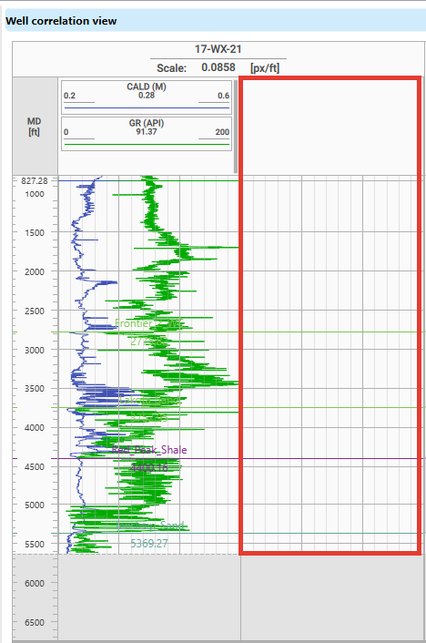
Right-click the well name header and select Add New Track in the menu shown above. An empty track appears for that well, as shown below.
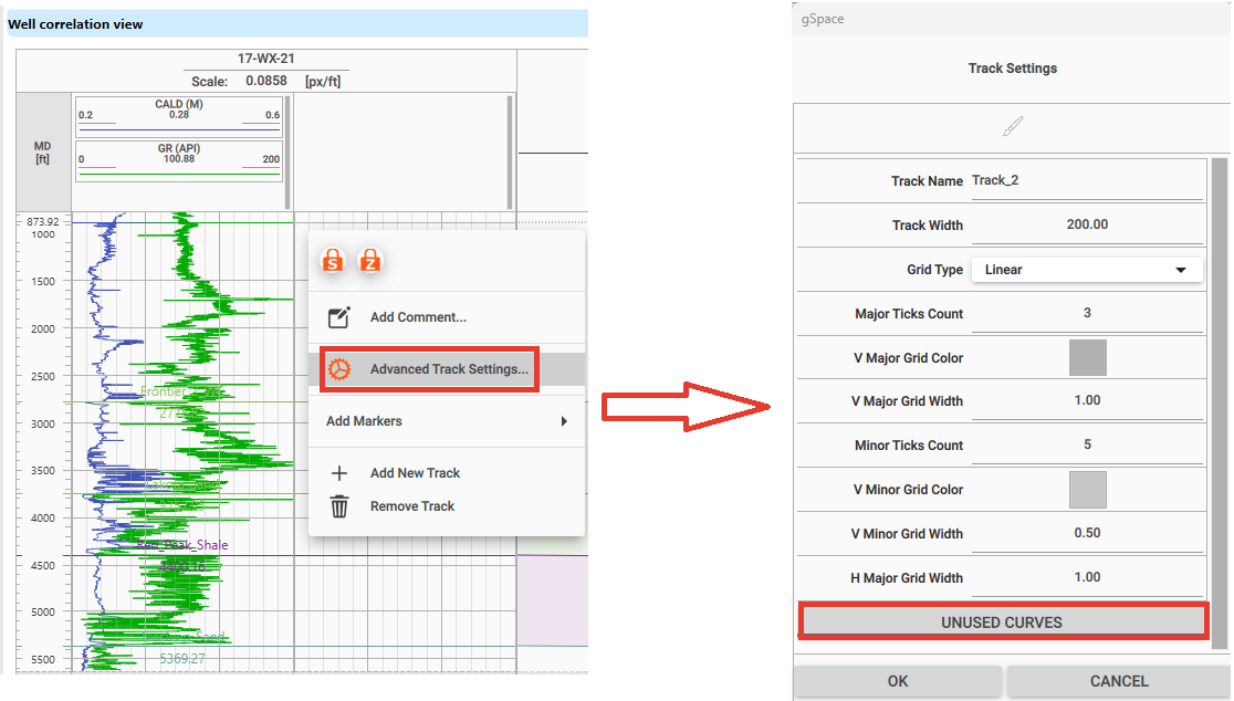
Right-click the new track and select Advanced Track Settings... to open Track Settings.
In Track Settings, expand Curves to list the well's available scalar curves. Tick a curve to add it to the selected track; untick it to remove it from this track only. Each LAS curve type subgroup has a switch: turn it on to add all curves of that type to the selected track, or off to remove them from that track. The Neutron Porosity subgroup and its switch are shown below. The same curve can appear on several tracks.
If the well has imported array channels, expand Curves (arrays). Tick a channel to add it to the selected track; untick it to remove it from that track only. The same channel can appear on several tracks. The track keeps its own Track Name and Track Width.
For a curve already displayed in this well, you can also click the new track's header to make it active, then turn that curve off and on again in the Data Manager. Its earlier track placements return, and it also appears on the active new track.
All these curves are added with default settings. To change the display settings of the individual curves, Right click inside the curve panel.
Track Settings
Each track within the Well Correlation view can be individually configured for optimal visualization of log data.
To access the Track Settings, right-click within the desired track area and select Advanced Track Settings....
In Track Settings, open Grid Type to see the available choices below.
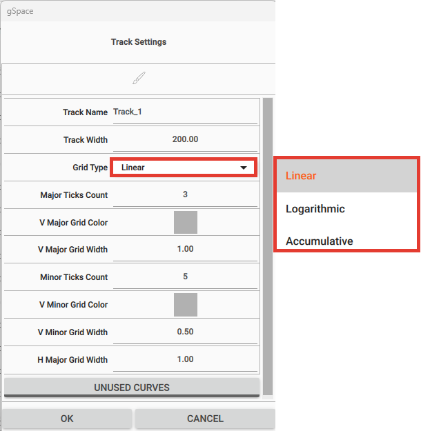
The following options are available:
- Track Name: Name of the track (e.g., GR, Density).
- Track Width: Controls the visual width of the track in pixels. A new track starts at 200 pixels, and a track that receives a seismic gather starts wider. The same width can also be set directly in the view: press the left mouse button on the right border of the track and drag horizontally to resize it while the button is held, down to a minimum of 50 pixels. An open Track Settings window follows the drag, and the resulting width is kept with the view like the other track settings.
- Grid Type: Defines how the values in the track are scaled and drawn. The options include:
- Logarithmic: Useful for logs with values that span several orders of magnitude, such as Resistivity (ILD, LLD).
This type of curve benefits from logarithmic scaling to better distinguish low and high values in the same track.
- Accumulative: Ideal for plotting cumulative values, such as net pay, cumulative porosity, or total thickness curves.
This setting allows the user to display running totals, which are especially useful in reservoir analysis and zone summation.
- Dipmeter: Draws structural dip data, such as bedding, fractures, faults and joints, as a tadpole plot instead of curves.
Each sample is drawn as a filled circle with a straight tail. The horizontal position of the circle is the dip angle on the dip scale of the track, and the tail points in the compass direction of the dip azimuth on the page, where 0° points up (north) and 90° points to the right (east), regardless of whether depth grows downwards. Tadpoles are drawn only at the depths that have valid values in both required curves; the data is not resampled.
The track header shows Dipmeter followed by the current dip scale in parentheses, for example Dipmeter (-10–100°). Hovering the cursor over a depth shows Depth, Dip and Azimuth, and also Feature and Quality when those optional curves are bound.
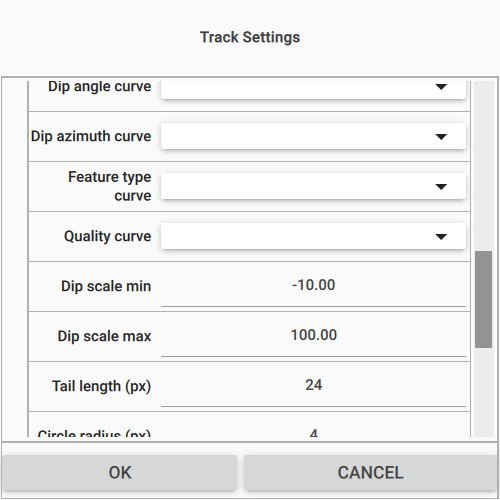
When Grid Type is set to Dipmeter, the Track Settings window gains a Dipmeter group with the following options:
- Dip angle curve: The curve that supplies the dip angle. Required.
- Dip azimuth curve: The curve that supplies the dip azimuth. Required.
- Feature type curve: Optional curve that assigns each sample to a feature type, which sets the color of its circle.
- Quality curve: Optional curve whose value is shown when the cursor is hovered over a sample.
- Dip scale min and Dip scale max: The dip range that the width of the track covers, -10 and 100 by default.
- Tail length (px): Length of the tadpole tail in pixels, 24 by default.
- Circle radius (px): Radius of the tadpole circle in pixels, 4 by default.
- One color swatch per feature type: Bedding (blue), Fracture (red), Fault (black), Joint (green), Unconformity (magenta) and Other (gray). When no feature type curve is bound, all circles are drawn in gray.
Dip data is prepared as ordinary log curves and loaded with the standard LAS, ASCII and CSV import. The import recognizes the common dip mnemonics: DIPA, DIP_ANGLE and DIPDEG as Dip Angle; DAZI, AZIM, DIPAZ, DIP_AZIMUTH and DAZIM as Dip Azimuth; DIPTYP and DIP_TYPE as Dip Feature Type; and DIPQ, DIP_QUAL and DIPQUAL as Dip Quality, so the curves can be selected directly in the lists above. Each well in a well section has its own Dipmeter track, and the settings are stored with the project like the other track settings.
- Major Ticks Count: Number of major vertical grid divisions.
- V Major Grid Color / Width: Set the color and width for major vertical grid lines.
- Minor Ticks Count: Number of minor divisions between major grid lines.
- V Minor Grid Color / Width: Set the color and width for minor vertical grid lines.
- H Major Grid Width: Adjusts the thickness of horizontal major grid lines.
Perforation tracks
To display imported perforation intervals in the Well correlation view, right-click the well name header and choose Add New Track. Right-click the empty track, choose Advanced Track Settings..., and set Grid Type to Perforation in Track Settings. In the Perforation group, choose the well's imported Dataset. A new Perforation track may initially use the first available dataset. Each track shows one dataset; add another track to display a second dataset.
Set Display to Filled interval, the available display mode. Each interval appears as a filled block between its top and bottom depths. Overlapping intervals occupy parallel lanes so both remain visible; intervals without an overlap use the full track width. Under Labels, choose whether blocks show Status, Stage, Top/Bottom, Shot density and Date. Status and Stage are on by default. A block omits labels that do not fit.
Under Styling, choose colors for Status: Open, Status: Closed, Status: Planned, Status: Squeezed, Status: Abandoned and Status: Unknown. Their fill and outline patterns also differ, so statuses remain distinguishable without color.
Hover over a block to read its dataset, depths and status, together with any recorded shot density, phase, stage, date and comment. Click a block to select it and pin its readout. Right-click a block for Perforation Properties to select it, Show in Data Manager to locate its dataset, or Clear Perforation Selection to clear the selection. Shot symbols are not displayed; the track currently shows filled intervals only.
Curve Settings
To customize how individual well logs are displayed within a track, the user can right-click on the log curve and select Curve Settings.
This opens a window where various visual and functional options can be adjusted. The example below shows the settings of a Filled Lines curve that uses a palette.
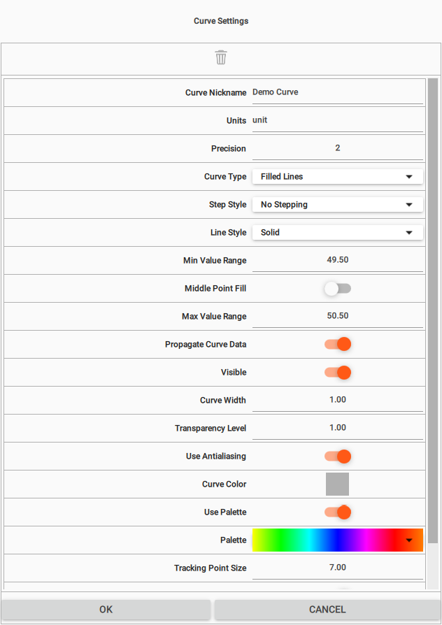
Key Options in Curve Settings:
- Curve Nickname: A user-friendly label displayed on the track (e.g., “GR” instead of “Gamma Ray”).
- Units: Measurement units for the curve (e.g., “API”, “Ω·m”, “g/cc”).
- Precision: Number of decimal places shown for the curve values.
- Curve Type: Defines the visual representation of the curve. Available options:
Notes
- Lines and Filled Lines are best for continuous logs (e.g., GR, DT, Density).
- Points may suit sparse or point data (e.g., deviation surveys).
- Lithology is for categorical data (e.g., rock type).
- Spikes is useful for sparse or event-style logs; for scanned raster logs use the Raster logs feature instead.
- Step Style (Available only for “Lines” and “Filled Lines”): Defines how curve segments transition between depth values:
Notes
Step styles are helpful when displaying categorical or blocky data, such as lithology, saturation zones, or interpreted layers.
For example, Step Down might be used to show interval top values, while Step Up could reflect base markers.
- Middle Point Fill (Available only for “Filled Lines” curves on tracks whose Grid Type is not “Accumulative”): Controls where the fill of a Filled Lines curve starts. By default this option is off and the area is filled relative to the curve itself (its left or right side). When enabled, the fill is drawn relative to a fixed reference line instead of the curve edge.
- Middle Value: Appears when Middle Point Fill is enabled and Use Palette is off; if the curve uses a palette, this row is hidden. Sets the value of the reference (middle) line; samples with values on either side of this line are filled with the corresponding left or right side pattern.
- Point Shape (Available only for “Points” curves, together with Point Size and Point Pattern below; the three rows are hidden for every other curve type): The symbol drawn at each sample. The list holds Circle, Circle (outline), Square, Square (outline), Triangle Up, Triangle Up (outline), Triangle Down, Triangle Down (outline), Diamond, Diamond (outline), Cross, Plus and Star. Circle is the default and matches the way Points curves were drawn before, so an existing view is unchanged until another shape is chosen. Circle, Square, Triangle Up, Triangle Down and Diamond are filled with the Curve Color, while the (outline) variants and Cross, Plus and Star are drawn as outlines or strokes in that same color, so an open circle can be told from a filled one and several point series in one track stay distinguishable in grayscale print. The chosen symbol is also drawn in the sample of the curve in the track header, and it is stored with the curve like Curve Color and Point Size, so it is kept in saved views and in well templates.
- Point Size: Size of the symbol in pixels, measured as its outer bounding box and applied in the same way to every shape.
- Point Pattern: An image drawn at each sample in place of the symbol. While a pattern is set it takes precedence, so Point Shape applies only when no Point Pattern is set.
- Visible: Toggle to show or hide the curve.
- Curve Width: Adjusts the thickness of the curve line.
- Transparency Level: Set the curve’s transparency (useful for overlapping curves).
- Use Antialiasing: Enables smoother curve edges for better visual quality.
- Curve Color: Manually set the color used to display the curve.
- Propagate Curve Data: Copies the current curve display settings to the same curve in the other wells of the section.
To remove any of these curves, the user can simply click on the Delete Curve  icon. By default it is Grey in color. As the user hover the cursor, it will turn into Red.
Working with Palettes
Instead of drawing a curve in a single color, the user can color it by value using a palette. In Curve Settings, enable Use Palette and then choose a predefined palette (colormap) from the Palette selector. Each sample is then shaded according to its value. See Working with Palettes for details.
The palette editor lets the user adjust the color range and add or move color stops. The edited palette can be kept Local to this curve only, or switched to Global so it is saved and can be reused for other curves.
Note: Use Palette applies to curves drawn as Filled Lines.
For lithology curves, the curve menu provides a Lithology Map action, which lets the user assign a color and fill pattern to each lithology class.
Spectrum tracks
An imported NMR array appears in an automatically created track whose name starts with Spectrum: in the Well log and Well correlation views. The default display is a colour heatmap. To add the same channel to another track, use Curves (arrays) in Track Settings. There is no Spectrum choice in Grid Type. See Import DLIS for loading the channel and setting T2 bin values and units.
Right-click the array channel header to open Curve Settings. For stacked spectra along depth, turn on Draw Spectrum Curves and turn off Draw Colormap. For the heatmap alone, turn off Draw Spectrum Curves and turn on Draw Colormap. Turn on both to overlay the spectra on the heatmap. Palette changes the heatmap colours; Draw Wiggles is a separate trace display option.
Borehole image tracks
An array channel imported with Kind set to Borehole image appears in an image log track. Right-click its curve header to open Curve Settings. See Import LAS files for the import step.
Set Colour Limits to Auto - static to scale over the whole logged interval, Auto - dynamic to scale within a sliding depth window set by Dynamic Window, m, or Manual to use Manual Colour Min and Manual Colour Max. Auto - static is the default. For image tracks, these controls set the displayed range; palette-editor value limits do not.
For Manual, enter a minimum lower than the maximum. The limits are saved separately for each image channel when you save the project, so separate passes can keep different ranges. If the pair is unset or invalid, the image uses the whole-interval automatic range until valid limits are entered. Values outside a valid manual range take the palette's end colours; areas without image data remain gaps.
An imported image track uses the FMI resistivity palette by default: lighter colours represent more resistive values and darker colours more conductive values. A palette saved in a well template overrides that default; use Palette in Curve Settings to choose another.
The track header shows Image Orientation° above N, E, S, W, N and degree labels 0, 90, 180, 270, 360, aligned with the image guide lines. Its mode button cycles Static, Dynamic and Manual. Beside the colour bar, Static and valid Manual show numeric limits. Dynamic shows its mode and window length in metres because its limits vary with depth. If a Manual pair is invalid, the readout shows the automatic range actually used.
Raster logs
Well log raster images (for example scanned strip logs) can be displayed in the Well Correlation view alongside curves, markers and comments. Rasters are imported per well using the Open raster wizard.
Click a raster image in a track to select it. The selected image is drawn with a highlight border, and only one image is selected at a time.
To inspect a raster more closely, right-click it and choose Open enlarged view. The command is enabled only when the right-click is on a raster image.
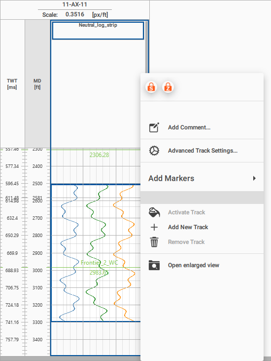
The image opens in an enlarged preview panel along the right side of the Well Correlation view, so the tracks and the depth axis stay visible beside it. The panel shows the raster at a larger scale in its original orientation; its header holds the image name and a Close button, and MD begin and MD end below it give the depth interval that the image covers.

Roll the mouse wheel over the preview to zoom in and out around the cursor, and drag the image with the left mouse button to pan it. Fit scales the whole image back into the panel. Previous and Next move to the neighboring raster images of the same track in depth order, and are disabled when there is no further image in that direction. Selecting another image in the track updates the open panel as well.
Zones in the Well correlation view
In the Data Manager, select a zone's checkbox to show it in the Well correlation view, or clear the checkbox to hide it. See Markers for creating zones and changing their colours. A checked zone appears by default as a filled interval in each well where both its top and base marker picks exist. A well missing either pick has no fill for that zone.
The fill connects adjacent wells only when both wells have the zone. It uses the zone's own colour rather than the top marker's age colour. The default transparency is 70%; change it with Zones Transparency (%) in Global Settings.
Depth maps
A depth map that is ticked under Maps in the Data Manager is also displayed in the Well Correlation view, as a horizontal line that crosses every well. The line is drawn at the measured depth at which the well trajectory actually meets the map surface, so deviated wells are placed correctly instead of at the plain true vertical depth of the map.
A well that does not cross the area of the map, or that has no valid trajectory data, simply shows no line for that map. Clearing the checkbox of the map in the Data Manager hides its lines again.
Every displayed map is given an automatic default color. To change how its line is drawn, open Global Settings and use the Map: group of that map, described above.
A map line is read-only in the Well Correlation view: it cannot be dragged to another depth, and moving the cursor over it keeps the ordinary pointer instead of the double arrow that appears on a marker line. Its depth always follows the stored map, so the line stays consistent with the map value at each well; to change a map, use the Map editor view. Right-clicking a map line still opens its display settings, and well markers keep their usual editing behavior, described in Working with Markers.
Managing Marker Sets in the Data Manager
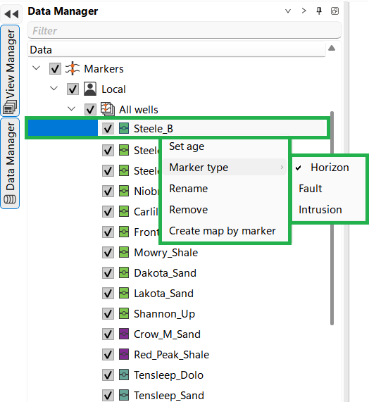
The Data Manager interface allows users to manage and customize marker sets for wells. The following functionalities are available:
- Marker Set Options (Left Panel):
- Set Age: Assign a specific geological age to the selected marker set.
- Marker Type: Classify markers as either Horizon, Fault, or Intrusion. This helps in categorizing and visualizing different types of geological features.
- Rename: Change the name of the selected marker set.
- Remove: Delete the selected marker set from the project.
- Create Map by Marker: Generate a map based on the selected marker, visualizing its distribution across the study area.
- New Marker Set Management (Bottom Left Panel):
- This panel allows the creation of a new marker set. Once created, the new marker set appears in the list, ready for further customization and data input.
- Marker Set Actions (Right Panel):