Palettes control how well data is coloured in the Well correlation view. Instead of drawing a curve in a single fixed colour, a palette maps colour to value, which makes continuous logs and interpreted classes (lithology, facies, zones, saturation) easier to read and compare between wells.
Enabling a Palette
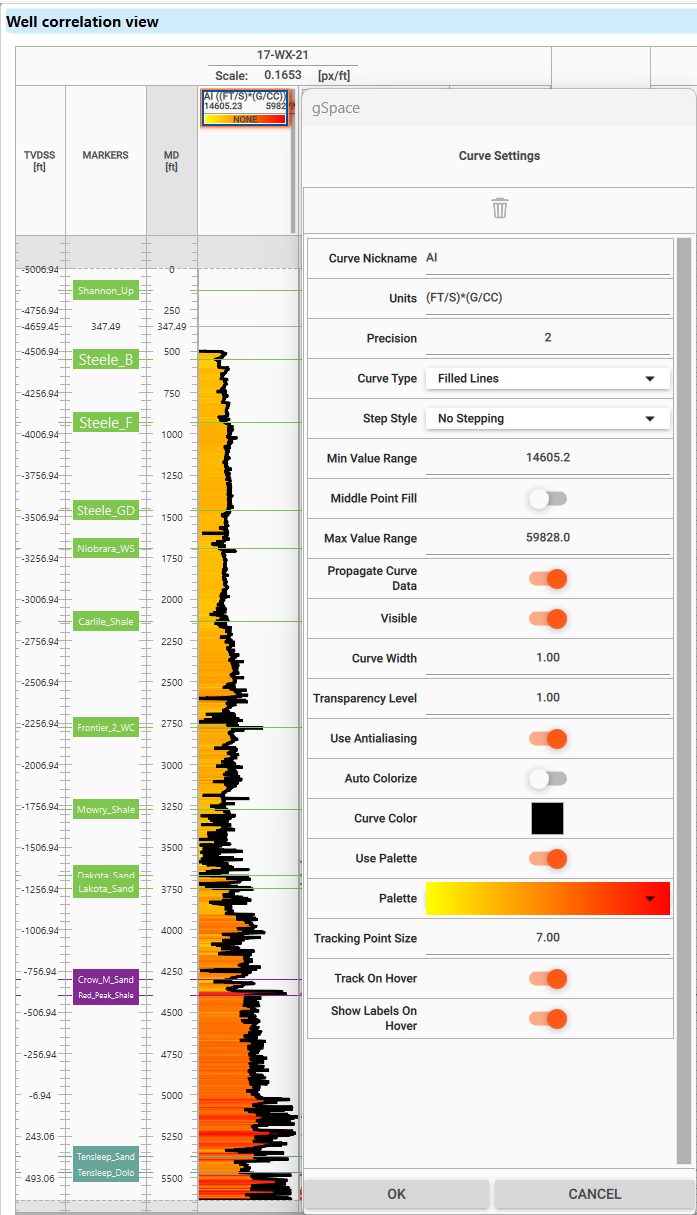
Right-click a curve header in the correlation view to open Curve Settings, then turn on Use Palette to colour the curve by value. Palette colouring applies to curves drawn as Filled Lines, so set the curve style accordingly first.
Choosing and Editing a Palette
•Select a palette — choose a predefined colormap from the Palette selector in Curve Settings.
•Edit colour ranges — open the palette editor to adjust colour stops, value limits and the colour assigned to each interval.
•Local or global — keep the palette Local to the selected curve, or save it as Global to reuse it elsewhere in g-Space.
•Check the value range — confirm the colours match the expected curve range so key intervals stand out clearly.
Lithology and Discrete Data
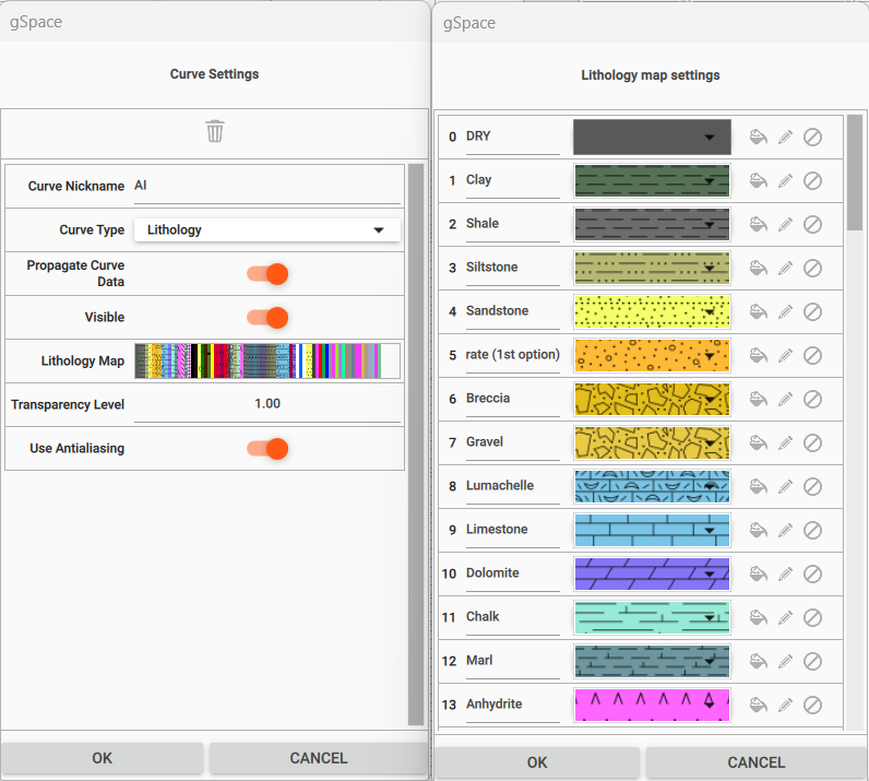
For discrete logs, set the Curve Type to Lithology in Curve Settings and open the Lithology Map to define how each class is drawn. Assign a colour and a fill pattern to every lithology class (for example clay, shale, sandstone, limestone or dolomite); use the colour picker to fine-tune class colours so the lithology column reads clearly across wells.
See Also